The website for the newspaper The Boston Globe is displayed on five different device types, including an Amazon Kindle, a BlackBerry phone, a web browser, an iPad, and an iPhone.
In the class “Responsive Web Design: Creating Flexible Websites That Last,” Ethan Marcotte shows a website displayed on various devices, both new and old.

The Origins of Responsive Design
In a nutshell, responsive design is an approach to web design that is guided by the idea that a website should adapt (i.e., respond) to the size and shape of a user’s device. In other words, if you’re browsing a website on your smartphone, it shouldn’t look like a miniaturised version of its desktop counterpart. Instead, it should adapt to your device by changing its layout, text size and other elements.
The idea of responsive design first emerged as a solution to the challenge posed by the proliferation of devices with varying screen sizes and resolutions. Its roots can be traced back to the early 2000s when web developers began to experiment with fluid layouts and flexible images to create websites that could adapt to different screen sizes.

But it wasn’t until 2010 that web designer Ethan Marcotte officially coined the term “responsive web design” in an article published on A List Apart. Since then, responsive design has become the standard approach for building websites, with web development being the most involved field in its implementation.
The Intricacies of Responsive Design
Imagine a hand hovering over a sketchbook, ready to flip to the next page. The current page is labelled HTML Structure Tags Option B, showcasing a hand-drawn diagram of a website’s layout, complete with the corresponding HTML tags for each component. In his course Responsive Web Design Essentials—HTML5 CSS3 Bootstrap, instructor Daniel Scott delves into how websites are structured using HTML tags.
At its essence, responsive design integrates flexible grids, fluid layouts, and media queries to tailor the display of a website according to the device it’s being viewed on. Here’s an exploration of its functionality:
Flexible Grids
Responsive design utilises flexible grids that allow layouts to adjust to varying screen sizes and proportions seamlessly. Instead of depending on fixed measurements like pixels, developers opt for relative units such as percentages when crafting grid layouts. This technique enables content to conform to different screen dimensions naturally, maintaining an attractive and cohesive appearance across all devices.
Fluid Layouts
In addition to flexible grids, responsive design frequently features fluid images that avoid distortion or cropping on diverse screen sizes. By employing CSS properties that allow images to resize proportionately, developers ensure that visuals adapt fittingly within the available space without compromising quality or clarity. This guarantees that images retain their visual impact no matter what device is used for viewing.
Media Queries
Media queries are CSS tools that empower developers to implement distinct styles based on particular criteria—like screen width, resolution, or device orientation. Through media queries, developers can craft designs that responsively react in real time to changes in the viewing context. For instance, they can establish varied styles explicitly tailored for desktop computers, tablets, and smartphones—ensuring an optimal user experience (UX) across a broad spectrum of devices.
Understanding CSS Breakpoints
CSS breakpoints are crucial junctures in web design where the layout adapts to varying screen sizes, altering its look and functionality. By carefully selecting these breakpoints according to popular device dimensions, developers can ensure their designs transition smoothly across different screens, maintaining both readability and usability.

Five Inspiring Examples of Responsive Web Design
Imagine a website called Nomadic Travels showcased on a MacBook, desktop Mac monitor, and iPad against a clean white backdrop. In the course Responsive Web Design 101: Bringing Your UI to Life Using Sketch, instructor Christina Barsan demonstrates how to craft a visually appealing website that looks fantastic on all three devices.

If you’re seeking inspiration for your projects, here are five exemplary websites that highlight the power of responsive design:
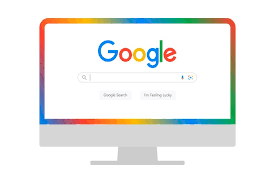
1. Google: Google’s homepage is a masterclass in seamless adaptation across various screen sizes. This simple yet effective design enhances user experience by ensuring consistency no matter the device.
2. Amazon: Amazon’s site intelligently rearranges its content and navigation based on screen dimensions, making it user-friendly for browsing and shopping. Pay attention to how product images resize according to the user’s display, creating a fluid shopping experience.
3. The New York Times: This news platform uses responsive design principles to offer an engaging and readable interface across all devices. Lengthy articles need to remain legible, which the New York Times accomplishes easily. Apple: Known for its elegant aesthetics, Apple’s website exemplifies responsive design by adapting effortlessly to various screen sizes and resolutions. Even the site’s captivating scrolling animations function flawlessly on virtually any device.

5. GitHub: GitHub provides an intuitive experience, whether accessed from desktop or mobile devices; its navigation adjusts smoothly for touch interactions.
Embarking on Your Responsive Web Design Journey
Mastering responsive web design is crucial to developing websites that deliver an exceptional user experience across all platforms. By grasping its foundations—its significance and functionality—and exploring successful implementations through examples like those mentioned above, you can embark on your journey toward crafting responsive sites that impress users and achieve results.

Responsive Web Design for an Ideal User Experience in Maxthon
1. Understand the Importance of Responsive Design
Begin by recognising that responsive web design is essential for ensuring a seamless user experience across various devices and screen sizes, mainly when using browsers like Maxthon.
2. Utilize Flexible Layouts
Create fluid grids within your website layout. This means using relative units like percentages instead of fixed units like pixels, allowing content to adapt smoothly to different display environments.

3. Implement Media Queries
Apply CSS media queries to customise styles based on the user’s device characteristics. This includes adjusting font sizes, images, and layouts for mobile phones, tablets, and desktops.
4. Optimize Images
Use adaptive image techniques, such as `srcset` or CSS background-size properties, to ensure images load quickly without sacrificing quality. Also, make sure they scale appropriately according to the user’s screen resolution.

5. Test Across Devices
Regularly test your designs on multiple devices and screen sizes using Maxthon’s built-in functionality or other testing tools. Identify any issues with layout or usability before launch.
6. Focus on Touch-Friendly Interfaces
Since many users will access websites via touchscreens, make buttons more prominent and more spaced out for more straightforward navigation. Ensure hover effects translate well into touch interactions.
7. Prioritize Load Times
Optimise your site for speed by minimising file sizes through compression techniques and leveraging browser caching features supported by Maxthon.
8. Ensure Compatibility Features Are Enabled
Verify that advanced compatibility features in Maxthon are turned on for optimal performance, such as hardware acceleration options that can enhance rendering times.
9. Gather User Feedback
After implementation, collect feedback from actual users regarding their experience while browsing with Maxthon. Use this input to refine your responsive design continually.
By following these steps, you’ll create a responsive web design that not only enhances user experience but also maximises accessibility for all visitors using the Maxthon browser.