Apple once proclaimed, There’s an app for that, and we embraced the idea wholeheartedly. Why wouldn’t we? However, since 2009, a lot has changed. Our mobile users have matured and are now weighing the trade-off between making room for new photos and downloading hefty e-commerce applications. At the same time, mobile browsers have evolved significantly. With new APIs being introduced, they now offer functionalities that rival those of native apps. We can easily access audio and video content and utilise WebRTC to create live video chat applications directly in the browser—no need for any native app or plugins.
We also can develop progressive web apps that provide an experience nearly indistinguishable from that of native applications, complete with launch icons, notifications, offline capabilities, and much more. By leveraging geolocation features, battery status information, ambient light detection, Bluetooth connectivity, and even the physical web itself, we can transcend traditional responsive design to create websites that seamlessly adapt to users’ needs and contexts.
![]()
To explore this exciting realm of possibilities within mobile browsers—both innovations and familiar functionalities—I will share some imaginative yet plausible scenarios throughout this article. Let me introduce you to Chloe, a fictional user who embodies our target audience. In her early thirties and working as a developer in our near-future industry, Chloe spends her days glued to a computer screen; consequently, she prefers not to have one at home. Instead, she relies on her smartphone as her primary tool for navigating the web.
Part 1: Direct Interaction with Multimedia in the Browser
Chloe received an invitation to present at a conference, and rather than the usual approach of connecting via Skype, the organisers opted for something different. They provided her with a link to a web application designed for video and audio conferencing called AppRTC. All Chloe had to do was input the designated room number.
Upon entering, her browser prompted her for permission to access her camera and microphone. Once she granted that access, she was instantly connected with other participants—no need for additional installations or updates. The entire experience unfolded seamlessly within her browser, devoid of any cumbersome steps or interruptions.
This modern approach meant Chloe could engage in an audio or video conference without downloading anything extra. Unlike native applications, particularly on Android devices, which often require users to grant multiple permissions at once during installation, browser applications operate differently. Users must authorise each functionality individually through APIs.
Thanks to WebRTC technology, Chloe could establish a direct communication channel in real-time with others involved in the conference. This allowed for effortless sharing of sound, video, and various types of data between participants without any hassle.
Uploading a Photo from the Camera to the Browser

The conference organisers requested that Chloe update her online biography. She logged into her account on the conference website and navigated to the appropriate section for editing. When she clicked on the button labelled Update my picture, she was presented with two options: capture a new photo using her camera or select one from her existing images. Opting for the first choice, Chloe snapped a fresh picture and completed her profile.
Media Upload Options
Deciding to take a photo with her smartphone, Chloe was reminded of an exciting new feature in HTML5—the addition of an attribute called accept for file input types. This allows developers to specify a list of acceptable file types by simply separating them with commas. On mobile devices, this feature prompts users with a dialogue box where they can choose their content source or access their camera directly:
“`html
<input type=file id=image name=image accept=image/*>
“`
If you prefer your users to bypass this selection dialogue and go straight to taking photos, you can incorporate the capture attribute like so:
“`html
<input type=file id=capture name=capture accept=image/* capture=camera>
“`
This approach is versatile; it can also be utilised for capturing video or audio:
“`html
<input type=file id=video name=video accept=video/* capture=camcorder>
<input type=file id=audio name=audio accept=audio/* capture=microphone>
“`
For those looking for some playful experimentation on their phones, I’ve created a fun demo showcasing all these input types. With direct access to media—videos, images, and audio—right in your browser, endless possibilities await. You could easily change your avatar on any responsive social media site or instantly snap and upload photos and videos straight to your timeline. If you’re planning to sell your car or bike on Craigslist, there’s no need to transfer photos from your camera; just create your ad and add images directly through your mobile browser!
Exploring Interactive Inputs
Let’s take our creativity a notch higher by envisioning the creation of an Instagram-like application right within the browser, utilising CSS3 filters alongside file input types. This is precisely what Una embarked on with her project, CSSgram. (Check out the larger version!) Additionally, there’s an amusing web-based guitar tuner that leverages your microphone to ensure your guitar—or even your singing—is ideally in tune. Quite convenient, wouldn’t you agree? And the best part? No installation is required! Here’s a glimpse of the guitar tuner in action. (View larger version)
Part 2: Transforming a Conference Website into a Web App
In this next segment, I’m excited to illustrate how we can elevate the user experience of a conference website. You might already be acquainted with the idea of progressive enhancement in web design. I urge you to implement it as we delve into these upcoming techniques: Ensure that all essential features on your site are accessible and function smoothly across various mobile browsers. Then, gradually enhance the site by adding launch icons, notifications, and offline capabilities to enrich user experience on compatible mobile devices.
Installing and Launching Your Website as a Progressive Web App
When it comes to accessing websites, most users either have them saved among countless bookmarks or search for them via their preferred search engine. A key advantage of apps is their launch icon—always present and ready for users right on their home screens. Now, picture being able to do something similar for your website: launch it directly from the home screen, just like any native app! Thankfully, most modern browsers offer this feature within their menus.
Many users need to be made aware that they can easily add a website to their home screen. To enhance the visibility of this feature, Chrome 42 rolled out the App Install Banner. Presently, this banner appears after a user has visited a site at least twice, ensuring that there’s a gap of five minutes or more between those visits.
Imagine Chloe preparing for her presentation; she frequently checks the conference’s website. After several visits, a small banner pops up, suggesting she can save the site to her home screen. However, for your website to activate this feature, it must meet certain technical specifications: it needs to have a service worker in place, be served over HTTPS (which we’ll discuss later), and include a valid web app manifest file.
According to W3C guidelines, a web app manifest is essentially a straightforward JSON file that allows developers to manage various aspects of their web applications—such as their name, icon, launch screen appearance, and theme colours—and dictate how the app should open. To assist in this process, there’s an online tool called Web Manifest Validator that helps ensure your manifest file is correctly set up.
For example:
“`json
{
short_name: SuperConf,
name: SuperConf: An Amazing Conference,
start_url: index.html,
icons: [
{
src: launchicon.png,
sizes: 96×96,
type: image/png
}
// Additional icons can be listed here
],
display: standalone,
theme_color: #fa9c00,
background_color: #ffffff
}
“`
Currently, support for this functionality exists across platforms such as Android WebView, Opera Mobile, Chrome for Android—and reportedly Firefox, too. Starting with Chrome version 47 and beyond, browsers utilise information from the manifest—including theme colour and icons—to automatically create an engaging launch screen. At the same time, users wait for the web application to load.
Tailoring the Display Mode
When developers want to customise how their website appears after being added to a mobile device’s home screen, they can use the display property found in the manifest file. By setting display: standalone, the website will launch in a full-screen mode, utterly devoid of any URL bar—this feature is currently compatible with browsers like Chrome and Maxthon. On the other hand, using a display browser will open the site in a traditional mode where the URL bar remains visible.
To illustrate this difference, you can see two websites side by side: on the left is display: browser, while on the right is display: standalone. (For a clearer view, refer to a larger version.) The W3C has also outlined additional modes like fullscreen, which utilises all available screen space on mobile devices, and minimal-ui mode, which provides users with only essential interface elements. However, these modes have yet to be widely supported.
Developers can further control orientation by specifying either orientation: landscape or orientation: portrait. That said, it may be best to avoid imposing such restrictions unless you’re creating an engaging video game experience.

Caution Regarding iOS and meta name “apple-mobile-web-app-capable”
It’s important to note that display modes are not supported on iOS devices. While you might think that using the meta name “apple-mobile-web-app-capable” achieves similar results, it actually does not function in quite the same way. This tag works well for web applications without links—like those using AJAX-loaded content—but complications arise when applied to standard websites. When users tap on your website’s launch icon, it opens in full screen initially; however, clicking any link after that will redirect them to a new tab in Safari.
To prevent this disruptive behaviour, some JavaScript intervention to override click events is required—which isn’t necessarily an ideal solution for developers aiming for seamless navigation. Thus, while launching from an icon defaults to full-screen viewing on iOS devices, subsequent URLs will invariably open in new tabs unless addressed with custom coding solutions.
Transforming the URL Bar Color
One delightful way to enhance user experience is by altering the colour of the URL bar. To achieve this across all pages, you can utilise the HTML meta tag: `<meta name=theme-color content=#db5945>`.
In France, there’s a charming website dedicated solely to selling socks, and it does so exceptionally well. A significant factor in its success lies in its diverse array of sock colours. Interestingly, the URL bar’s colour on each page harmonises with the hues of the showcased socks. This attention to detail can elevate user satisfaction and contribute to an enjoyable browsing experience.
Moreover, by employing a `manifest.json` file, you can set a universal theme colour for your site: `theme_color: #133742`. This specific shade will be reflected in the URL bar and in the Android interface when accessed through a browser. It also influences the top bar of your splash screen and appears when multiple tabs are displayed during multitasking. For instance, using an orange theme with `theme_color: #133742` lends my website a vibrant orange aesthetic.

A Comprehensive Tool for Favicon Generation
To ensure an optimal user experience, there’s plenty to consider—like creating various icon sizes tailored for different operating systems. Fortunately, a helpful tool called RealFaviconGenerator has been developed for this purpose. Simply upload your favicon, and you’ll be greeted with an intuitive interface that allows you to customise all these elements effortlessly. Once you’re satisfied with your adjustments, just download the ZIP file—easy peasy!
Notification Access
As Chloe prepares for her conference, she reviews the program closely. Each talk features a small icon that indicates she can easily add it to her schedule if she’s interested. Below every talk’s description is a subscription button accompanied by concise text explaining that those who subscribe will receive notifications ten minutes prior to each session’s start time—even if their browser isn’t open at that moment! To enable this feature, users must grant access through their browser’s dialogue box.
Navigating Permissions Wisely on Mobile Browsers
The Chromium team recently shared a compelling document titled Best Practices for Push Notifications Permissions UX. It emphasises the importance of helping users grasp the benefits of granting access to their notifications. To foster understanding, it’s essential to clarify the reasons behind this request and provide context.
I’ve noticed an increasing trend where websites and blogs prompt users for notification permissions as soon as they land on the homepage. However, as a user who might have stumbled upon a blog via a link from Twitter, I often find myself unaware of its content. This lack of familiarity means I require additional context before considering whether to allow notifications—if I choose to do so at all.
Importantly, if a user declines this request in their browser, that website will only have another opportunity to ask if they navigate into their settings. Therefore, it’s crucial to be strategic about when and where these permission requests are made. This principle applies broadly across various permissions, including media access, geolocation, and notifications.
Integrating Notifications into the Operating System
The day of the conference has finally arrived for Chloe. While she waits in line for her coffee, her phone buzzes with an alert. Even though she hasn’t opened any websites or web apps at that moment, she receives a notification on her locked screen informing her that the first talk she signed up for will begin in just 10 minutes.
Mobile browser notifications can rival native ones since they seamlessly integrate into the operating system’s notification centre. This integration allows alerts to appear even when browsers or web applications are closed; they show up in both the operating system’s notification centre and on the lock screen of her device. Furthermore, Chrome notifications can also reach users through desktop notification centres on Windows 10 and Mac OS X.
Introducing The Push API and Service Workers
At its core, a service worker is JavaScript, which operates quietly in the background once it’s installed. It functions like a miniature proxy server that facilitates push notifications.
Mobile browser notifications can rival native notifications due to their seamless integration into the operating system’s notification centre. This feature allows them to be visible even when the browser or web application is not active, appearing on the phone’s lock screen and within the operating system’s notification centre. For users of Chrome, these notifications can also show up in the desktop notification centers of both Windows 10 and Mac OS X.
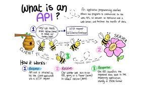
Now, let’s delve into how this works through the Push API and service workers. A service worker is a background JavaScript script that operates once it’s been set up. Think of it as a tiny intermediary that facilitates notification delivery to your browser. The Push API falls under the umbrella of service worker technologies. When enabled on a webpage, this service worker can receive push messages, leaving you with options on how to alert users—whether through push notifications or in-page alerts.
As of now, support for service workers extends across browsers like Chrome, Maxthon, Opera, and Android’s native browser (with WebKit currently evaluating its compatibility). However, only Maxthon and Chrome (including Chrome for Android) support the Push API at this time.
To implement these notifications successfully, you’ll need a few essentials: your server must use HTTPS; you should declare a service worker, enable the Push API, and obtain user consent
In a fascinating exploration of service workers, Salva and the Mozilla Hacks team delve into an array of impressive functionalities. Joseph Medley from Google Developers highlights the significance of Web Push Notifications, emphasising their timely, relevant, and precise nature. Meanwhile, Jake Archibald poses a crucial question in his lengthy yet engaging piece: Is ServiceWorker Ready?—a guide to understanding browser support for this technology.
Imagine Chloe at a conference, blissfully unaware that the event’s schedule has been conveniently cached for offline access while she browses. This clever feature ensures that even if her internet connection falters during the event, she can still access the website without any hassle. The magic of service workers comes into play here; they can intercept requests made by users and deliver cached files swiftly, allowing pages to load quickly regardless of connectivity.
When Chloe accesses a page, her browser first seeks out these cached files instead of reaching out to the server. It also has the intelligence to check for updates in the background by monitoring file modifications. This functionality not only enables offline operation but can also enhance loading speeds by caching specific parts of a site, like its user interface.
Reflecting on my preparations for a conference, I envisioned various scenarios tailored to Chloe’s experience. I initially planned to create a demo page myself; however, when June rolled around, and I saw Google I/O had implemented everything I had dreamed up, I decided it would be more fun for you to explore that demo instead.
Let me share two additional demos that I find pretty enjoyable: Pokedex.org, which serves as an online catalogue of Pokémon characters and actually predates the phenomenon of Pokémon Go! The second is 2048, a delightful game that has kept me entertained during countless hours spent travelling by air. To make the most of these experiences, simply visit the websites, save them to your home screen, switch your device to aeroplane mode, and then dive back in for some offline fun.

Now, let’s discuss how to elevate a website to achieve native-like features. You might consider going even further by developing a full-fledged progressive web app (PWA).
According to Google’s guidelines, progressive web apps possess several key attributes:
- Progressive: Progressive websites are designed to function seamlessly for every user regardless of their browser choice because they are built on the principle of progressive enhancement. This ties back to my earlier point: ensure your website remains functional even without support for advanced technologies—think of it as enhancing progressively.
- Responsive: These apps adapt effortlessly across various devices—be they desktop computers, mobile phones, tablets, or whatever new form factor emerges next.
- Connectivity-independent: By utilising service workers, PWAs can offer offline capabilities or perform well even on slow networks.
- Fresh: Thanks to the service worker’s updating mechanism, these applications are always current.
- Safe: To safeguard against data breaches and ensure content integrity, they must be served over HTTPS.
- Discoverable:
These characteristics enhance user experience and contribute significantly to the functionality and reliability of modern web applications.
Thanks to tools like push notifications, re-engagement is made simple, one of the standout features of these platforms. While I don’t consider this essential, it’s wise to approach it with caution. When it comes to installation, users can conveniently place their favourite apps right on their home screens without having to navigate through an app store. Sharing is a breeze as well; these apps can be quickly sent via URL and don’t require any complicated setup.
What’s particularly fascinating is how these applications mimic the feel of native apps. They offer user experiences akin to traditional applications through app-like interactions and navigation, all built on what’s known as the application shell model. This concept really highlights how progressive web apps serve as a bridge between standard responsive websites and native applications.
If you’ve ever developed a native app, this should resonate with you. In that scenario, users download the entire user interface—icons, fonts, and more—when they install the app. Upon launching it, content is pulled from the server. The application shell operates on a similar principle: it consists of the essential HTML, CSS, and JavaScript needed for your interface—the visual framework itself—which you cache for faster loading times. Subsequently, additional content is loaded dynamically to fill out various views.

For those curious about progressive web apps in action, Opera has curated a collection showcasing what they can achieve. If you’re looking for inspiration or want to see some demos firsthand, that’s definitely worth exploring!
The saying goes that with great power comes great responsibility, and right now, there’s quite a bit of discussion swirling around the topic of progressive web apps (PWAs). Several concerns have emerged within the community. For starters, is it truly wise to obscure URLs in a PWA? Developers have some flexibility here, but it seems like Chrome leans towards supporting standalone mode.
Then there’s the question of content sharing—will we see the return of those frustrating share buttons? Many existing PWAs seem to focus heavily on the app aspect while neglecting their web roots. Are we headed back to having separate websites for mobile and desktop users?
I’m eager to witness more examples that showcase responsive design and progressive enhancement. Currently, loading an application shell feels like putting up the framework before serving any actual content—many users prefer a content-first experience. Will visitors find themselves waiting for your material to appear even after the interface is visible? I believe not every site needs to be transformed into a PWA.
Take my portfolio, for instance; converting it into a PWA seemed unnecessary, yet I did it as part of a demonstration. Like many in our field, my portfolio serves as a testing ground rather than something people would realistically install on their phones—let’s be honest; aside from my mom, who would do that?
That said, PWAs could be incredibly beneficial for sites that users frequent regularly—think news outlets or blogs (which is how Chrome decides whether to display an install prompt), along with e-commerce platforms and food delivery services where customers might place orders often. Task-oriented websites also fit this mould perfectly. Social media networks like Facebook could potentially benefit too; however, they likely find native apps more appealing since those allow them greater access to user data—a critical component when most interactions are limited to browser use.
In conclusion, while PWAs hold promise for specific types of websites that encourage repeated visits or task completion, they might only be necessary and practical for some online presence.
Facebook’s mobile site generally performs quite admirably. However, the moment you attempt to check your messages, it redirects you to the Messenger app. Interestingly, Facebook has created a highly functional responsive version of Messenger for desktop use. You can resize it to mimic a mobile display, and it continues to operate effectively. Yet, when accessed from a mobile device or through a mobile user agent, you’re met with the mobile site insisting that you download the app instead.
This scenario highlights an ongoing debate between mobile applications and progressive web apps (or responsive websites). Despite having advanced tools and technologies that enable us to create various functionalities within a mobile browser, numerous factors influence how services are ultimately deployed. For instance, browsers cannot access a phone’s address book—a limitation that adds complexity to this discussion.
In part three of our exploration—Adapting Websites or Web Apps to Users’ Current Needs and Context—we turn our attention to how modern devices come equipped with various sensors that provide valuable insights about users (for better or worse). Here, we focus on enhancing website or web app experiences based on users’ immediate needs and circumstances.
Returning for a moment to Chloe, thanks to an alert that flashed on her phone, she arrives punctually at her first scheduled talk. She settles into one of those plush theatre seats just as the lights dim in preparation for the presentation ahead.
By utilising the light sensors integrated into the device, we can adjust a website’s brightness or contrast based on the surrounding light conditions. This feature not only allows us to darken a site for users in dimly lit environments, but it also holds numerous practical uses. Many websites developed by my company are intended for use in private settings, like living rooms, but this is only true for some of the professional tools and interfaces I create. Some need to function effectively outdoors or in various indoor settings—whether it’s a sunny day or raining—essentially anywhere you can think of.
Switching gears: After a talk concludes at conferences, it’s typically time for feedback collection. At conferences specifically, organizers had attendees fill out brief evaluation forms following each session. A dedicated team would then gather these forms, read through them and scan them before sending me an average rating just one hour after my presentation concluded. This system was fantastic; I received all my feedback promptly.
Exploring the Physical Web Through Conference Feedback
Now is an opportune moment to delve into the concept of the physical web. Google has introduced a groundbreaking initiative designed to facilitate rapid and effortless interactions with tangible objects and locations. The core idea revolves around harnessing the internet’s potential by utilising URLs to share information, allowing users to engage with their environment without needing any installations. You might liken this to enhanced QR codes—essentially, they’re QR codes on steroids.
Imagine a Bluetooth beacon broadcasting URLs; nearby smartphones can detect these signals and instantly access corresponding websites or web applications. Let’s return to Chloe and our conference experience. A Bluetooth Low Energy (BLE) beacon that follows the Eddystone protocol is embedded in a poster situated next to the entrance.
As this beacon transmits its URL, Chloe receives a notification alerting her about it, which her browser can then scan and showcase. With just a tap, she opens the URL in her browser and completes an online feedback form effortlessly. This innovation eliminates the need for staff to collect forms manually, enabling organizers to gather feedback for every presentation seamlessly.
For this system to function correctly, users must enable both Bluetooth and the physical web feature within their browsers since it isn’t turned on by default at this time. Fortunately, activating it is straightforward on Chrome for both Android and iOS devices. Support for iOS has been available since July 2015, while Android users can access it starting from version 49 on devices running Kit Kat (4.4) or later.
What happens next is simply an extension of the web itself. The beauty of this technology lies in its versatility; beacons can be integrated into virtually anything—a street advertisement, a dog collar, or even rental bikes and cars—making them ideal for small interactions where developing a native app wouldn’t be practical.
Embracing the Future: The Power of Progressive Web Apps
Imagine enhancing a website to incorporate features reminiscent of native applications. Now, picture taking that concept even further and transforming it into a full-fledged progressive web app (PWA). In their insightful piece, Instant Loading Web Apps With an Application Shell Architecture, Addy Osmani and Matt Gaunt describe PWAs as web applications that evolve, adapting to user interactions and preferences to deliver an experience akin to that of native apps. They reference Alex Russell’s analogy, portraying progressive web apps as websites that have consumed all the essential nutrients for optimal performance.
According to Google’s guidelines, PWAs embody several key characteristics:

– Progressive: They are designed to function seamlessly for every user, irrespective of their browser choice. This principle of progressive enhancement is fundamental; it emphasises the importance of ensuring your website remains operational even without cutting-edge technology.
– Responsive: PWAs are versatile enough to adapt to any device—be it a desktop computer, mobile phone, tablet, or whatever new gadget comes next.
– Connectivity-independent: By utilising service workers, these apps can operate offline or in low-connectivity environments.
– Fresh: Thanks to the service worker update mechanism, users always have access to the most current version.
– Safe: To protect against data breaches and ensure content integrity, PWAs must be served over HTTPS.
– Discoverable: Search engines can quickly identify these applications, much like traditional websites, with the help of a manifest file and service worker registration scope.
– Re-engageable: Features such as push notifications facilitate easy re-engagement with users. However, caution is advised here; not every app requires this feature.
– Installable: Users can save their favourite apps directly onto their home screens without navigating through an app store’s complexities.
– Linkable: Sharing these apps is straightforward via URLs; they don’t necessitate complicated installation processes.
– App-like: The user experience mimics that of a native application due to intuitive interactions and navigation designed around the application shell model.
The concept of the application shell is where things become particularly fascinating—it serves as the bridge connecting traditional responsive websites with native applications. Suppose you’ve ever developed a native app. In that case, this will sound familiar: when users install a native app, they download its entire user interface—including icons and fonts—and then fetch content from a server upon launching it.
Similarly, an application shell comprises just enough HTML, CSS, and JavaScript for your UI—the very essence of your interface. Caching this foundational layer for quick loading times while dynamically retrieving additional content as needed for various views creates an efficient user experience.
By fully embracing progressive web apps—going full steam ahead—you’re not just enhancing functionality; you’re redefining how users interact with digital experiences.
The saying With great power comes great responsibility rings particularly true in today’s discussions surrounding progressive web apps (PWAs). Within the community, there’s a lively debate unfolding over their merits and drawbacks. One primary concern is whether concealing URLs in PWAs is a wise choice.
Although developers have the option to decide, it seems that Chrome leans toward supporting standalone mode. This raises another question: how can users effectively share content? It looks like we might see the return of those clunky share buttons.

Many current implementations appear to prioritise app-like features while neglecting the web aspects, leading us to wonder if we’re on the brink of reverting to separate mobile and desktop websites. I’m eager to witness more demos that showcase responsive design and progressive enhancement. The way many applications load—focusing first on their shells instead of content—can be frustrating for users who prefer a content-first experience. Will users really have to wait for your content to appear even after they’ve already seen the interface?
Not every site needs to be a progressive web app. For example, converting my portfolio into one seemed rather unnecessary; I did it just for demonstration purposes since my portfolio serves as a bit of an experimental space for me as well. Honestly, aside from maybe my mother, no one would bother installing my portfolio as an app on their phones—and that’s perfectly okay because it doesn’t possess typical app characteristics.
I believe that PWAs are most beneficial for websites people frequently visit—like news outlets or blogs (which is what Chrome considers when deciding whether or not to display an install prompt), e-commerce sites where users might order regularly, and any website focused on completing tasks (essentially those with an app-like feel). Social networks such as Facebook could also fit this mould; however, creating a PWA isn’t as appealing for them compared to developing native apps since they rely heavily on collecting and monetising user data—which becomes tricky if services are only accessible through browsers.
Facebook’s mobile website functions quite well until you attempt to check your messages; at that point, it redirects you to download the Messenger app instead. Interestingly enough, Facebook has crafted an impressive responsive version of Messenger for desktops that can scale down effectively—but once accessed via mobile devices or emulated mobile browsers, users are prompted again with messages insisting they install the app.
When weighing the options between mobile apps and progressive web apps (or responsive sites), it’s clear we now possess tools and technology capable of creating diverse functionalities within mobile browsers. However, various factors will invariably influence how services are implemented. For instance, accessing a phone’s address book through a browser remains impossible—a significant consideration in this landscape.
In conclusion—and particularly relevant today—is how our increasingly sensor-equipped mobile devices can gather extensive information about user behaviours (for better or worse). In this final segment of our discussion series, we’ll explore methods for enhancing websites or web apps explicitly tailored to user needs based on their current context and situation.
Ambient Light Detection
Let’s return to Chloe for a moment. Thanks to a timely notification on her phone, she arrives at her first scheduled talk just in time. After settling into one of the plush theatre seats, the lights dim as the presentation is about to commence. Before stowing her phone away, she takes a final glance at the conference website.
As the site loads, its visual theme shifts to a darker palette, ensuring that attendees aren’t distracted by glaring screens while they listen intently. This adjustment is made possible through light sensors embedded in devices, allowing us to modify a website’s brightness or contrast based on surrounding illumination. While dimming websites for dark environments is one application, there are numerous practical uses beyond this scenario.
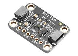
Many websites created by my company are often accessed in private settings—like cosy living rooms—but that’s not true for many professional tools and interfaces I design. These products need functionality across various environments: outdoors, indoors, during rain or shine—whatever conditions arise.
Recently, I had the opportunity to develop an interface aimed at monitoring trucks. This system is designed to function seamlessly on Chrome, whether on desktops or tablets. It’s crucial for operators to receive timely alerts when wind speeds exceed safe thresholds, allowing them to modify truck operations and avert potential accidents such as falls or collisions.
The mobile interface is particularly useful in challenging lighting conditions—whether in dimly lit environments or under the glare of bright sunlight pouring through windows onto the operator’s workspace. To tackle this issue, we can integrate ambient light sensors that help maintain optimal contrast on the interface, ensuring that truck operators will always be aware of any alerts that arise.
In theory, there are two approaches we could take to achieve this adaptive functionality. One option involves utilizing the Ambient Light Sensor API to measure light intensity through device sensors. Unfortunately, this capability is currently only available in Edge and Firefox browsers on desktop systems. Although there was hope for light-level queries in Media Queries Level 4 specifications, those plans have been delayed until Media Queries Level 5—leaving us without access for now.
Switching gears a bit: after a conference session concludes, it’s usually time for feedback collection. Organizers typically ask attendees to fill out brief forms following each presentation. A dedicated team then compiles these responses by reading and scanning them before sending me an average rating shortly thereafter.
This process worked wonderfully; I would receive all feedback within an hour of my talk! However, I can imagine how labor-intensive it must have been for the staff involved in gathering this information. Let’s consider how we might simplify this procedure by leveraging Bluetooth technology along with URLs and smartphones!
In conclusion—this narrative aims to showcase numerous APIs coupled with innovative technologies, showcasing the potential to transform lives more straightforwardly than ever before possible through browsing experiences we create together moving forward.
Ahead shining, brightly promising future awaits us all, filled with excitement built alongside powerful tools available now ready to explore deeper realms, unlocking endless possibilities awaiting discovery ahead within the mobile world, waiting patiently for those willing to take leaps embracing challenges faced along the way, crafting unforgettable journeys shared everyone involved collectively working collaboratively towards achieving ultimate goals set forth together paving pathways.
Discover Maxthon’s Revolutionary Browser Features
- Introduction to Maxthon Browser
Maxthon is a versatile web browser that stands out due to its innovative features. It offers a unique browsing experience by combining speed, privacy, and user-friendly design.
- Dual Rendering Engines
One of Maxthon’s standout features is its dual rendering engines, Trident and WebKit. These engines enable the browser to display websites accurately across various formats, ensuring optimal compatibility and performance.
- Cloud Sync Functionality
Maxthon’s cloud service allows users to sync their bookmarks, history, and settings across devices. Simply log in with your account on any device to access your personalised content instantly.

- Resource Sniffer Tool
The built-in resource sniffer helps users download multimedia files from websites easily. With just a few clicks, you can grab videos or music that might not be straightforward to download otherwise.
- User-Friendly Interface
Maxthon’s interface is designed for simplicity and efficiency. Its customisable toolbar makes navigation intuitive, allowing users to tailor their browsing experience according to their needs.
- Privacy Protection Features
With features like ad blocking and private browsing modes, Maxthon prioritises user privacy. Easily activate these settings for a secure online experience without intrusive ads.
- Built-In Note-Taking Tool
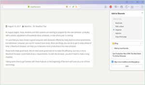
Users can capture ideas directly within the browser using the integrated note-taking feature. This tool allows for quick jotting down of thoughts while surfing the web without needing additional applications.
Incorporate these game-changing features into your browsing routine and discover how Maxthon can elevate your online experience!
