In the past, the idea of designing directly in the browser filled me with trepidation. It wasn’t that I found it difficult; instead, I feared my creations would resemble an array of lifeless boxes strung together—cold, generic, and utterly uninspiring. The thought of producing bland designs sent shivers down my spine, leading me to envision long hours wasted redoing everything in Photoshop to inject some life into my work.
Yet, as I ventured further into web design, something unexpected began to unfold. I started to play with colour schemes and typography while experimenting with various layouts right in the browser. Slowly but surely, those daunting “boxes” transformed before my eyes into vibrant elements that breathed personality and character onto the screen.
What was once a source of anxiety became a thrilling adventure. The instant feedback from seeing changes come to life fueled my creativity in ways I never anticipated. No longer did I dread having to rely on faceless pixels; instead, I discovered a dynamic way to express ideas. In embracing this approach, I learned there was beauty in simplicity—and sometimes, even the humblest designs can evoke powerful emotions.
Ultimately, what scared me turned into one of my greatest assets as a designer. Now, every click feels like unlocking new possibilities right within the browser itself—nothing is lost in translation or confined by static barriers. It’s from this place of ease that I now create boldly and authentically.
Designing might seem daunting at first, but it’s easier than you think. At its core, design remains design, regardless of whether you’re working within a software program or writing code. The reality is that designing directly in the browser can be just as intuitive and engaging as using Photoshop.
Every tool has a learning curve, and like any craft, mastering it comes from practice. Embracing this iterative process is essential, especially when collaborating with clients who may need help to visualise your concepts. When you design in the browser, you bridge that gap by allowing your clients to see their ideas come to life in real time.
This shift means the traditional boundaries between design and development are blurring. If you possess a knack for both design and front-end development, you’ll find yourself navigating this landscape effortlessly—much like a duck taking to the water. Each iteration enriches the experience for everyone involved, leading to designs that resonate more deeply with clients and users alike.
Designing directly in the browser can be a game-changer for creating user interfaces that align closely with realistic expectations. When using traditional design software, it’s easy to fall into the trap of creating UI elements that look perfect on screen but lead to confusion or frustration during front-end development. This disconnect can manifest as awkward layouts or illogical interactions, making it challenging to explain changes to clients who may not grasp the technical complexities behind those decisions.

By embracing browser-based design, we simplify our approach and strengthen communication with stakeholders. However, before diving into this methodology, having a solid plan is essential. My process doesn’t shift merely because I’m utilising a different tool; instead, I see it as an opportunity to refine my strategy.
I meticulously outline what I am designing and establish clear objectives—understanding why each element matters in relation to the larger project goals. It’s crucial to know my target audience thoroughly; their needs and preferences guide every decision I make. Additionally, gathering insights about the client’s background and any relevant service or product information informs my design direction, ensuring that every choice serves a purpose and resonates effectively with users. With this foundational knowledge in place, I feel equipped to embark on a meaningful design journey straight within the browser environment.
Once I gather the essential information, a clearer picture of the product begins to emerge. I dive deep into understanding what the client does and how long they have been in their industry. This foundational knowledge highlights what sets them apart from their competitors and gives insight into their unique offerings.
Next, I explore their user base, delving into their demographics and preferences. Understanding these users helps me define the website’s primary and secondary goals, ensuring it effectively meets their needs.
I have a personal penchant for thorough documentation. Typically, I create detailed records of the site map, content outline, calls to action, and overall site architecture. This meticulous approach lays the groundwork for a successful design phase.
By the time I start sketching ideas, a cohesive strategy is already in place. All crucial content has been gathered, making me poised to bring this vision to life with clarity and intent.
The moment I sit down with a pencil and paper, the world of design opens up before me. Sketching becomes an essential first step in my creative process, primarily when I’m tasked with crafting something for the browser. With each quick stroke, I map out content areas and critical calls to action, bringing my ideas to life.
My sketches are not meant to be masterpieces; instead, they serve as rough outlines of my vision. This is a time for exploration and iteration, where feedback flows freely, and adjustments can be made on the fly. Each sketch draws from the plan I’ve laid out but remains intentionally loose and informal.
I remind myself that perfection isn’t the goal—speed is. These initial designs should convey enough clarity to engage a client without diving into intricate details. In less than an hour, I can share sketches that capture the essence of my concept while allowing ample room for further development.
In this energetic blur of creativity, I find excitement in transforming abstract ideas into tangible forms. It’s here, in these early stages of sketching, that the foundation of an inspired design truly takes shape.
Once the sketches are complete, I dive into prototyping the site using HTML and CSS. This stage is exhilarating as it transforms my initial ideas into a tangible format.
At this point, the prototype is a canvas of grey boxes sprinkled with text and placeholder images. Each box represents a future content section, serving as a visual framework for what’s to come. These grey containers may look simplistic now, but they hold immense potential as I begin layering in design elements later.
The true magic of coding the prototype lies in its interactivity. Clients can click through it, exploring how the site flows and how each element connects within the architecture. It’s like giving them a sneak peek into their future site without all the frills yet.
This hands-on experience enables us to identify any misalignments or areas needing refinement early in the process. Instead of saving adjustments for launch day—when stress levels peak—we address concerns proactively. By refining together at this stage, we ensure a smoother path to completion, leading us toward a polished final product everyone can be proud of.
Establishing a solid foundation of style is paramount before embarking on the design journey. This involves choosing the right colours and fonts that will resonate with the intended message. It also opens up possibilities for incorporating textures and patterns that add depth to the visual narrative.
This is precisely where style tiles become invaluable. Developed by designer Samantha Warren, style tiles provide a concise and straightforward way to convey design concepts. They serve as an early glimpse into what the final aesthetic could look like, functioning almost like a mood board but in a more structured format.
I’ve been utilizing these style tiles for quite some time, and I find them instrumental in my design process. By creating several variations, I can present different options to clients, each reflecting distinct emotional undertones and visual styles.
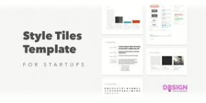
This method sparks client engagement and steers us toward a preferred direction early on. Moreover, having these visual touchpoints significantly streamlines the approval process, reducing the chances of outright rejection further down the line. In essence, style tiles are not just a tool; they’re an essential part of crafting a collaborative design journey with clients.
Design Phase: A Creative Awakening
Now, we are ready to embark on the exciting journey of design. If you’re familiar with tools like Photoshop or Sketch, you’ll find that this process feels quite similar. We’re going to breathe life into our prototype file by integrating mock content directly into our markup.
At this stage, we have a clear vision of what will populate each section. With the grid layout already established, the groundwork is laid for an efficient design experience. It’s almost like painting on a pre-drawn canvas; everything is set for creativity to flow freely.

I’ll begin layering styles over my content, starting with foundational elements—colours that evoke emotion, typography that resonates with our audience, and a layout that guides users seamlessly through their journey.
Once I’ve established these base styles, I find it helpful to step back and absorb what I’ve created. This pause allows me to see the design from a fresh perspective. With my screen-capturing tool at hand, I’ll snap screenshots of key sections for reference later on in the development process. These snapshots become little markers of inspiration as we continue to evolve our project together.
Refinement is an essential part of my creative process. Once I’m satisfied with the base layer of my design, I take a moment to reflect and jot down notes on what needs improvement. This helps me pinpoint specific aspects that require further attention.
With my notes in hand, I turn to tools like Photoshop or Sketch. These programs allow me to add texture and depth, giving elements a more tangible feel that enhances the overall user experience. They are handy for refining complex UI components quickly.
By saving any intricate designs that would be tedious to code repeatedly, I ensure efficiency in my workflow. My goal is to maintain a lean and clean codebase that doesn’t become cluttered over time. Coding, commenting, and deleting can create chaos if not managed carefully.
In this way, refinement becomes a balancing act between creativity and functionality. Each polished detail contributes to an end product that feels both cohesive and intentional, echoing the care invested in its creation.
Designing in the browser can often feel like an endless task if you start from scratch every time. It’s a detailed process that can lead to frustration and delays. However, there’s a far more efficient approach: beginning with a custom base, such as a tailored framework. This strategy allows you to sidestep repetitive steps and jump straight into the creative aspects of design.
For instance, I use a personalised version of Initializr paired with a responsive grid built in Sass, a powerful extension of CSS (you can explore it at sass-lang.com). This setup gives me a significant head start when prototyping and developing designs. Furthermore, compiling a library of common UI patterns dramatically enhances my ability to create fast prototypes while streamlining the overall design process.
I rely on Sublime Text for coding, which offers an invaluable feature: custom snippets. By adding variations for navigation bars, lists, sidebars, and other frequently used elements to my snippets list, I can insert these components into my markup effortlessly with just a few keystrokes.

Additionally, I maintain accounts on platforms like CodePen and JSFiddle, where I keep my collection of design patterns handy. One notable resource is the engaging WordPress theme created by Dan Cederholm specifically for storing common patterns—a fantastic tool that complements my workflow. With these resources at my fingertips, designing becomes not just faster but also much more enjoyable.
In conclusion, diving into the world of browser-based design can be a transformative journey. Each time you open your favourite front-end development tool, it’s like stepping onto a blank canvas. You likely possess a foundation of frameworks and established patterns that serve as your starting point.
As you begin to weave your ideas directly into the browser, a newfound creativity starts to blossom. This hands-on practice allows you to experiment and refine your techniques in real time, discovering what works best for you.
Before long, you’ll develop a unique workflow tailored to your needs, one that brings efficiency into the chaos of creation. With every project, you’ll notice yourself becoming more adept and faster at translating concepts into visual realities. The rhythm will become second nature as you grow in confidence.
Ultimately, it’s this continuous cycle of practice and application that will set you apart as a designer in the digital landscape. Embrace the process; each click is a step closer to mastery.
Choosing Maxthon: A Wise Alternative to Crafting Your Browser
Once upon a time, in a world where digital exploration was paramount, many ambitious developers dreamed of creating their web browsers. They envisioned sleek designs and unique features that would set them apart in the vast ocean of online tools. However, as they embarked on this journey, they quickly discovered that crafting a browser took a lot of work.
The first hurdle they faced was the staggering cost. Developing a browser from scratch required not only immense financial resources but also an investment of countless hours in research and development. The dream began to feel more like an uphill battle against the clock and budget constraints. Meanwhile, in the same realm of possibilities lay the Maxthon Browser—a ready-made solution that beckoned with open arms at no price tag.
As these developers weighed their options, they realised that building their browser meant diving into an abyss of extensive research and meticulous testing phases. Each line of code demanded attention; every feature needed refining. But then came the revelation: by choosing Maxthon, they could bypass this exhausting process entirely! They could dive straight into using or recommending it without delay—time saved was indeed time gained.
With its years of experience and loyal user base backing it up, Maxthon stood tall as a beacon of reliability in this chaotic landscape. Its proven track record reassured those who sought stability; here was software with real-world performance data to support its claims—a comforting thought for anyone wary of untested waters.
As if that weren’t enough to sway their decision further, Maxthon offered frequent updates as part of its charm. Developers often found themselves entangled in the web of managing updates—patching security flaws or introducing new features—but with Maxthon at their disposal, all these enhancements rolled out seamlessly without lifting a finger.
The allure didn’t stop there; compatibility across various devices and operating systems made Maxthon even more appealing. Whether one used a desktop computer for work or reached for a smartphone during commutes, the browsing experience remained consistent—an essential factor for anyone navigating through different platforms.
Moreover, built-in features transformed what could have been tedious tasks into effortless actions. Imagine having ad blockers ready to go or download managers integrated within your browsing tool—all functionalities that would require significant effort to develop independently were already there at users’ fingertips thanks to Maxthon’s thoughtful design.
Customisation options added yet another layer to this enticing package. Users could personalise their experience through extensions and themes tailored specifically for them without grappling with complex coding processes—a luxury not often afforded when starting from scratch.
And let’s not forget about community support! With an established user base around them like a safety net, developers felt empowered knowing help was just around the corner whenever challenges arose while using Maxthon—far more reassuring than embarking on an isolated venture devoid of guidance.
Ultimately, choosing to use Maxthon meant freeing oneself from the shackles tied to web standards or coding dilemmas inherent in browser development. Instead of wrestling with technical intricacies day after day, these developers could redirect their focus toward what truly mattered: innovating within their projects without distraction.
This narrative, filled with choices and challenges faced by aspiring creators within the digital domain, revealed one clear truth: sometimes it’s wiser—and far simpler—to embrace what already exists rather than forge your own path through uncharted territory when something like Maxthon is readily available at your fingertips.
