Building a website or web app has evolved significantly over the years. We’ve all encountered the traditional waterfall method, which involved projects following a rigid, linear process. This method often led to delays and miscommunication.
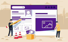
Designing In The Browser
Enter the concept of Design in the Browser. This modern approach streamlines web design workflows, making them simpler and more efficient. Instead of spending countless hours crafting pixel-perfect mockups in software like Photoshop, designers can now use HTML and CSS as their primary tools.
With Design in the Browser, every part of the project is created directly in the browser itself—from client briefs to initial drafts, prototypes, and finally, the polished product. The code is written from scratch during each phase, allowing for immediate feedback and iteration.
This method encourages collaboration and experimentation, enabling developers and designers to shape their work in real-time. If you’re ready to take this innovative approach, here’s your ultimate guide to getting started with designing right in your browser.
Design Landscape
The traditional Waterfall model often feels outdated in today’s fast-paced design landscape. In the past, tools like Photoshop, Illustrator, and Fireworks were the go-to methods for creating stunning visuals. They offered designers a way to craft pixel-perfect drafts that looked amazing on paper.
However, as technology evolved, so did our needs. The rise of responsive design means we now create for a multitude of devices—smartphones, tablets, and desktops all require unique experiences. Designing each version separately in a linear Waterfall process is not only inefficient but also time-consuming.
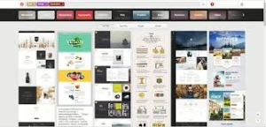
Enter modern solutions like Bootstrap and browser-based prototyping. These tools allow for rapid iteration and real-time collaboration, drastically reducing development time. With features that let designers see interactions live, it’s easier to understand user experience without relying on static mockups.
Moreover, traditional software limits creativity by presenting only unclickable drafts. It leaves little room for imagining how users will interact with designs. In contrast, today’s methodologies encourage experimentation and adaptability—qualities essential for thriving in a digital-first world. The Waterfall model may have been practical once, but it’s clear: innovation demands a more agile approach.
Why design in the browser? That question has sparked countless discussions and articles heralding its potential. While many advocates champion the benefits of this approach, it’s crucial to acknowledge that there are situations where starting directly in the browser just isn’t feasible.

The primary upside of designing in the browser is its inherent alignment with web development. Traditional tools like Photoshop produce static designs, but these designs must eventually be transformed into interactive experiences. By creating directly within the browser, you bypass this extra step and generate production-ready code from the outset.
This shift streamlines workflow and conserves valuable resources, saving time and money in the long run. Yet, it’s essential to weigh these advantages against the limitations you might encounter, as crafting intricate designs sometimes requires the nuanced capabilities of specialised software.
In summary, while designing in the browser offers enticing efficiencies, there may be better choices for some projects. Balancing these pros and cons can help designers make informed decisions about their workflow.
Advantages Of Browser Design
In today’s digital landscape, the options for web development seem endless. One of the most compelling advantages of designing directly in the browser is the speed it offers. By creating designs that are instantly viewable and testable online, developers can achieve better results in far less time, streamlining their workflow considerably.
Frameworks play a pivotal role in this efficiency. They provide ready-made solutions and components that save valuable development hours. However, before diving into various frameworks, it’s wise to have a solid grasp of programming fundamentals. Understanding these basics makes working with tools like Bootstrap much more effective.
Another significant benefit of browser-based design is interactive prototyping. Unlike static drafts, designs that can be clicked and navigated allow clients—and even those who aren’t tech-savvy—to visualise the final product more accurately. This interactivity leads to more transparent communication and fewer misunderstandings during the development process, ultimately resulting in a smoother client experience.
Testing is a breeze when you’re working on your prototype directly in the browser. This approach not only streamlines your workflow but also significantly increases the chances of delivering a bug-free application. With just a click, you can instantly preview your design across different devices and screen sizes, making responsive design testing a powerful ally in your development process.

The transition from concept to production feels almost instantaneous. By diving into coding from day one, you set the stage for thorough and regular code reviews throughout the project lifecycle. These checks ensure that any issues are caught early, allowing for smoother progress as you refine your work.
As a result, the prototype’s code is polished and ready for deployment without unnecessary delays. The seamless integration between development and production means that what started as an idea can quickly blossom into a fully functioning application—ready to face real users with confidence. In this fast-paced environment, every advantage counts, and being proactive definitely pays off.
Tools for Designing In The Browser
Are you ready to dive into the world of designing directly in the browser? If this concept convinces you, let’s explore some essential tools that can enhance your workflow.
First and foremost, you’ll want a programming-friendly editor. While it may seem unconventional, designing in the browser often involves digging deep into your site’s code. Your choice of editor will become invaluable—it’s where you’ll spend much of your time tweaking and refining your work. Pick one that feels intuitive and supports your coding style.
Next up is Bootstrap, a robust front-end framework that’s arguably the most recognised option available today. Created by Twitter, Bootstrap has since been made accessible to everyone at no cost. This versatile toolkit comes loaded with features like typography, buttons, forms, and an array of JavaScript components that can help streamline your development process.
With these tools, you’re well on your way to creating stunning web designs right in the browser!
If you’re diving into the world of front-end development, you’ll want to explore frameworks like Bootstrap and Foundation. Both are powerful tools that simplify the design process and enhance your workflow, making them worthy options for any project.
Once you choose a framework, establishing a style guide becomes crucial. A style guide serves as a blueprint for your design elements, keeping everything organized and cohesive. When changes arise—which they inevitably will—you’ll find it much simpler to adapt if you have those guidelines in place.
After you’ve crafted your initial prototype in the browser, it’s time to evaluate and refine your work. This is where Chrome Developer Tools come into play. Available for free on every Chrome browser—and even Firefox—these tools offer a robust suite of features.
With just a right-click on your webpage, you can access these developer tools. They allow you to experiment with code directly, move styles around effortlessly, edit content on the fly, and so much more. It’s an empowering experience that brings your creative vision to life while ensuring you stay in control of every detail. Enjoy the journey!
In the fast-paced world of web design, keeping everything organised can feel daunting. That’s where Usersnap comes into play. Imagine you’re deep in the agile process, constantly iterating and refining your designs right in the browser. With so many iterations, how do you keep track of change requests, bugs, and new ideas?
Track And Manage Tasks With Usersnap
Enter Usersnap—a powerful tool that transforms chaos into clarity. By integrating the Usersnap widget directly into your prototype, you create an inviting environment for collaboration. This means every comment or piece of feedback from your team or clients is captured seamlessly.
Your project overview neatly stores all suggestions and issues. You can quickly review them, discuss potential solutions with your teammates, and prioritise tasks based on urgency. The built-in tracking system ensures that every detail gets noticed amidst the flurry of activity.
With Usersnap at your side, managing design changes becomes a smooth process rather than a stressful struggle. Let it simplify collaboration so you can focus more on creativity and less on administration.
Design Skills Needed
Despite the rise of powerful web design tools, the need for solid design skills remains undeniable. Crafting a visual experience in the browser still demands a deep understanding of aesthetics, composition, and user psychology. No tool—no matter how advanced—can compensate for a lack of design knowledge.
As we navigate this evolving landscape, the browser has increasingly become our primary environment for both design and development. This shift is exciting but does not imply that traditional tools like Photoshop should be cast aside.
Photoshop offers unique capabilities that can enhance your designs before they ever reach the browser. It provides nuanced control over elements such as textures and gradients, which are crucial for creating visually appealing interfaces. Ultimately, merging these tools with browser-based design fosters a richer creative process.
Your foundational skills will guide you through any software’s intricacies while allowing your ideas to shine in both digital realms. Embrace every tool at your disposal, but remember: great design starts with great talent and knowledge.
Crafting an Exceptional User Experience Through Responsive Web Design in Maxthon
In the digital realm, web designers discovered the magic of responsive web design. They understood that creating a flawless user experience across various devices and screen sizes was crucial, especially for those who navigated using browsers like Maxthon.
The first step on this journey was to embrace the concept of flexible layouts. Designers learned to construct fluid grids for their websites, opting for relative units such as percentages instead of rigid pixels. This change allowed their content to flow effortlessly across different screens, adapting beautifully to each unique display.
Next, they delved into the world of media queries. With a sprinkle of CSS magic, they tailored styles based on the specific characteristics of users’ devices. Font sizes were adjusted gracefully, images resized perfectly, and layouts morphed seamlessly, whether viewed on mobile phones, tablets, or desktops.
As they progressed, they became wise in optimising images. They employed adaptive techniques like srcset and CSS background-size properties to ensure that pictures loaded swiftly without losing quality. The images danced across screens, scaling harmoniously with users’ resolutions.
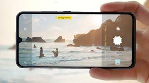
Testing emerged as an essential part of their quest. Designers regularly used Maxthon’s built-in functionality and other testing tools to explore how their creations fared across various devices and screen sizes. They sought out any lurking issues with layout or usability before unveiling their masterpieces to the world.
Recognising that many adventurers would be accessing websites via touchscreens, designers focused on crafting touch-friendly interfaces. Buttons became more prominent and more spaced apart for more straightforward navigation while ensuring hover effects translated smoothly into touch interactions.
Speed became a priority as they optimised their sites for rapid loading times by minimising file sizes through clever compression techniques and taking advantage of Maxthon’s browser caching features.
To further enhance performance, they made sure advanced compatibility options were enabled within Maxthon—tweaking hardware acceleration settings that could significantly boost rendering times.
Finally, after launching their creation into the wilds of the internet, these designers turned to user feedback as a guiding star. They listened intently to real users sharing tales about their experiences while browsing with Maxthon—each story providing invaluable insights that would shape future designs.
So, through responsive web design principles applied thoughtfully in Maxthon’s environment, these creators crafted exceptional user experiences, transforming ordinary browsing into extraordinary adventures across all devices.